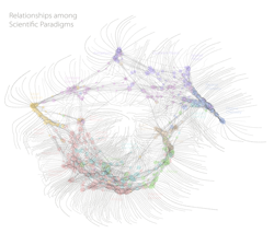
A Map of Science
This infographic has been around for quite some time. But I was reminded of it, while listening to a podcast, of a talk delivered by Stephen Downes (Downes, 2010). It’s one of those truly brilliant works that delivers an incredibly essential and disruptive message, especially to education.
Constructed by Kevin Boyack, Richard Klavans and Brad Palen, at Sandia National Laboratories, the graphic maps relationships between a wide variety of scientific disciplines, connections indicated by papers of one discipline citing a paper from a different scientific discipline. Here an explanation from the Sandia web site.
The map represents 800,000 scientific papers (shown as white dots) and shows relationships between them and different scientific disciplines. The “filaments” are common words unique to each “scientific paradigm” — the 776 red circular nodes or clusters of papers. Each node contains papers that are commonly cited together. Larger nodes have more papers. Nodes are connected with lines of various lengths and thicknesses, denoting the strength of the citation linkages between the nodes. Layout of the nodes was done using Sandia’s VxOrd clustering algorithm. Chemistry papers are found in the right-hand peninsula while astrophysics is located at the top. Medicine covers the large region at the lower left. (A map of science )
Explanation: http://goo.gl/8jMgm
Graphic: http://goo.gl/UvTcf
Downes, S. (Performer) (2010, May 7). Connectivism and transculturality. Stephen’s Web. [Audio podcast]. Retrieved from http://www.downes.ca/presentation/251
A map of science. (n.d.). Retrieved from http://www.sandia.gov/news/features/mapping_science.html