RSS

August 7th, 2014 - 1:22 am § by Ryann Warlick § in Data Sources, Data Visualizations

Mom and Dad: How they Spend their Weekdays (1965 and 2011)

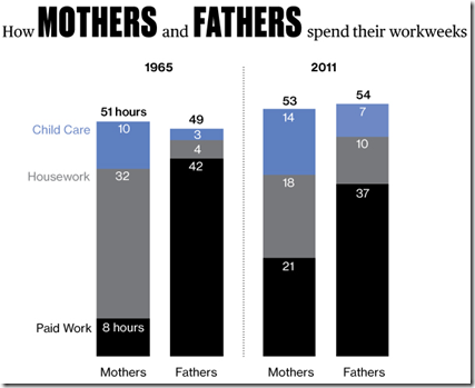
This is an interesting infographic showing the way the average American mom and dad spent their weekdays in 1965 and 2011. This is a great infographic to use as an example for how to create infographics.

First, it’s a great example of a bar chart. This type of chart can be used as a comparison between any two of the same ideas. It also shows how to compare two like items. In this case, years of significance for moms and dads. The data may only be available as late as 2011, but why 1965, what events were occurring in 1965 that make this a good date to compare to 2011?

Blog: http://goo.gl/4u8Q1K


July 18th, 2014 - 2:01 am by Ryann Warlick § in Data Sources, Data Visualizations, Humanities, STEM

10 Years of iMusic

Technology changes with time. As one piece of technology becomes superior, another becomes inferior. This infographic portrays something interesting, iPod sales and iTunes songs purchased increased together until the mid and late 2000s, but by 2010, iPod sales were decreasing while iTunes sales cont[...]


July 11th, 2014 - 2:49 am by Ryann Warlick § in Data Sources, Data Visualizations, Humanities

8 Great Things to do in London

Traveling is a lot of fun. Especially when one travels to another country or even just to another part of America, one is able to learn about another culture and different people. London may be one of the best cities in which to learn about a variety of cultures. One thing that threw me off [&hellip[...]


July 4th, 2014 - 2:36 am by Ryann Warlick § in Data Sources, Data Visualizations, featured, Humanities

America’s Birthday by the Numbers

Every year Americans celebrates their independence in a variety of ways, as this infographic shows. My family used to go to join my mom’s family by a lake for a picnic and then watch fireworks across the lake. My cousins would go early in the morning to get a spot right on the lake. I [&hellip[...]


July 3rd, 2014 - 1:49 am by Ryann Warlick § in Data Sources, Data Visualizations, Humanities

How Long Will It Take to Watch

Sadly, binge watching television shows has become the pastime where binge reading once was. However, this is an interesting portrayal of information. Beginning with Sherlock and going down to 24, this infographic shares how long it would take to watch a series of popular tv shows without a break (al[...]


April 29th, 2014 - 3:05 pm by Ryann Warlick § in Data Sources, Data Visualizations, history, Humanities, STEM

The most important developments in human history

There are a lot of developments here. Some of them we don’t appear to use anymore. However, without all of these developments, we would not be where we are today. Try to find scientists and poll them as to what are the most important developments, and then poll your students. After all the of [...]


April 28th, 2014 - 4:19 pm by Ryann Warlick § in Data Sources, Data Visualizations, STEM, STEM

The Beginning of Everything: The Big Bang

This infographic video goes through the the history of the Big Bang theory, both it’s discovery and how it worked. It is important to explain to your students that it is important to understand this theory, even if they do not believe it. It is important to appreciate and understand different [...]