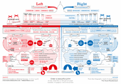
 Information is Beautiful author, David McCandless, posted what was apparently a provocative infographic in 2009, comparing the left and the right in the U.S. Congress. He has..
..finally updated this image after lengthy (and sometimes heated) discussion with right wingers. The goal was to smooth out my biases, really. As a left-leaning journalistic type, I had subtly – and unconsciously – biased the diagram to make the Left seem better than the Right. But taking in feedback – and no small-amount of fireballs in the comments – I’ve refined the wording and changed a few other subtle elements to hopefully rebalance the image.
I haven’t taken the time to compare the two, and as a somewhat left leaning educator type, it rings pretty true to me. The story here, though, is a realization of bias and an attempt to fix that. It’s just another example of the conversation that is our new information landscape.
Blog: http://goo.gl/pbGsh
Graphic: http://goo.gl/iIiqE
Comparison: http://goo.gl/3cwOv