 It’s Labor Day and I felt that it was important to point you to an infographic related to labor in America. The image to the right was a bit difficult to find. There’s another one out there, that, though it is quite informative and apparently well sourced, it is posted by a credit card company, and I’m not interested in linking to and improving their Google relevancy ranking.
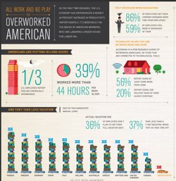
Overworked America is from one of my favorite producers of infographics, Column5 Media. Did you know that over the past two decades American productivity has increased 60%? At what cost? Check this graphic out. It might stimulate some conversation in business and other classes.
Web Page: http://goo.gl/cpEBc
Graphic: http://goo.gl/Cs22n
And how about a couple of bonuses. Here’s one that I found through TweetMeme. It’s producer is Workplace Tribes (an HR services firm) and it compares work day hours among various countries.
Blog: http://goo.gl/ry9Aw
Graphic: http://goo.gl/nUsIG
This last one may well be the most interesting. It comes from Fastcompany and tells the story of the American work force by comparing its number from 1971 and 2010.
Web Page: http://goo.gl/DfOOU
Graphic: http://goo.gl/5oJq3