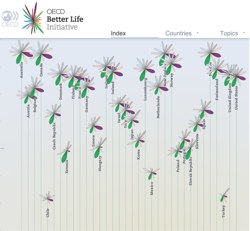
 This is one of the most interesting data visuals I’ve seen in a while. It’s a an interactive tool, made by OECD called Better Life. It ranks nations based on a variety of criteria, including: housing, income jobs, community, education environment, and more. What’s cool about this graphic is that you can choose the criteria for ranking and adjust the weighting of each. For instance, when I selected housing, environment and health, and weighted them all highly, Australia, Canada and New Zealand surfaced to the top of the list.
It might be interesting to ask students to discuss the criteria and how important they are and then launch the visualization. It may provoke some interest in particular countries.
The Graphic: http://goo.gl/I35gq
About the Graphic: http://goo.gl/SBgNl