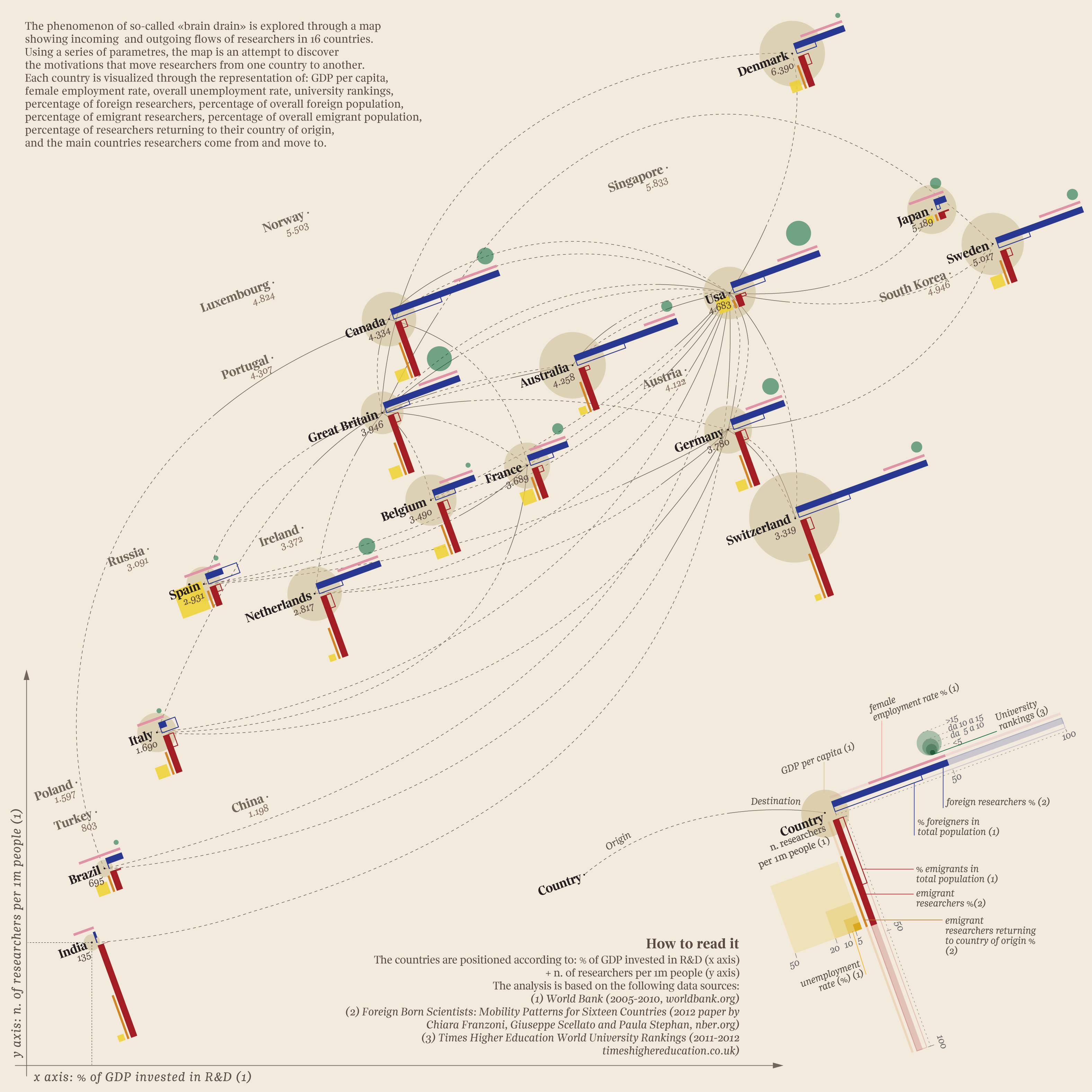
This is one of the infographics that is not so easy to read, but well worth the effort. It maps out the flow of scientific research talent across 16 countries. Created by information designer, Giorgia Lupi and here team in Italy, as a follow-up to several celebrated graphics (this and this), it was not initially apparent to me that it is a scatter plot.
Some things are better discovered than obvious.
The X axis represents the percent of the country’s GDP that is invested in research and development, with Sweden, Japan, Denmark and Switzerland leading the field. The Y axis represents the number of researchers in the country for ever one million people. At the top here are Denmark, Japan, Sweden and the U.S.A.
The lines show the migration of scientific researchers. For instance, Denmark exports talent to Great Britain and the U.S. The U.S. exports to Canada, Germany, Great Britain and Australia. Just about everybody exports to the U.S.
Of particular interest are the percent of foreigner and emigrant researchers in the countries compared to the total foreign and emigrant residents.
All in all, it’s worth a study by teachers and STEM and social studies students.
- Originating Blog - http://wp.me/peM2X-6ma
- The Graphic - http://goo.gl/Oh2iTZ