 This is one of the coolest infographics I’ve seen in a while, and it’s been sitting in my queue for more than two weeks. Part of my wants to post this as a fun Friday graphic — but this is important. What makes us happy? What makes for a good life?
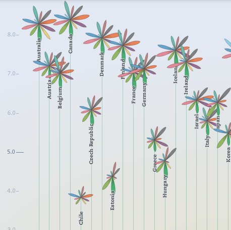
The interactive infographic, from the Organisation for Economic Co-operation and Development (wp), provides an interesting way to learn about countries by aligning them with what you think makes us happy. Each country is displayed as a flow with eleven peddles, one for each of the criteria of happiness, which you can scale to your personal preference — giving housing, education, job/life balance comparative votes of 0 to 5. Then the country peddles are rearrange themselves, based on statistical indications of life there, the ones most aligned to your preferences moving to the top.
You can also rank them by adjusting the order and click the peddles to learn more about those countries.
I wonder about asking students to vote based on their personal preferences, and then learn more about and report on the countries that move to the top and to the bottom. They might also create a survey for their family members and neighbors at home and see which countries they raise up and sink.
For me, I’m pretty happy in the U.S., though, according to the Better Life Index, I’d be happier in Canada, Australia, New Zealand or Norway. Probably not Norway, because I can’t make my throat do the things their language requires. ![]()
Blog Post: http://goo.gl/6WyRN
Graphic: http://goo.gl/MLwVL
Video Demo: http://goo.gl/JxMKd