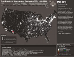
Last week I posted timeline infographic that illustrated the American westward movement by way of the opening of U.S. Post Offices. Here, from Flowing Data, is something similar that timelines the opening of U.S. Newspapers. You can watch a video here, but the author of the graphic, Stanford University, has an interactive version here.
One possible focus of conversation about this graphic might be to compare it with the U.S. post offices. Which should come first. Where do they come first. Students could watch the videos, pausing, and noting in a spreadsheet when the first post office and newspaper opened in each territory, and did there seem to be some concentration point where the territory became a state.
May be another infographic in there.
Blog: http://goo.gl/lOa9E
Video: http://goo.gl/I9L5Y
Interactive: http://goo.gl/1D8kL