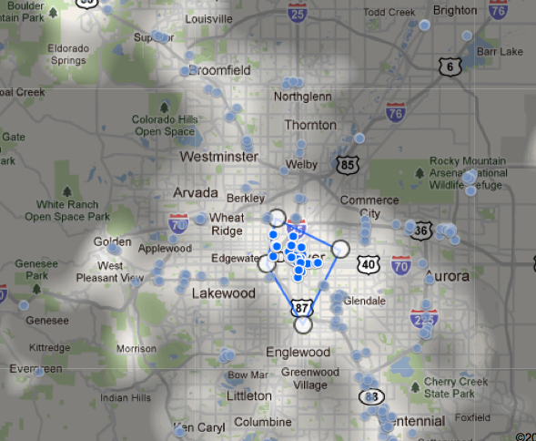
 I found this one via Infosthetics, but got more details about it from the Google blog, Inside Search. It’s a new Google experiment called Hotel Finder, and it is arguably not an infographic. I’m including it here because this is an interesting intersection between raw data and visualization. You can type in the name of a city (currently U.S. only) and blue dots show up for hotels, which are clickable and can be compared. Nothing new here.
What intrigues me is the spotlight feature. Portions of the city that are visited the most are spotlighted. That is, those parts of the map are highlighted, as if a light was shining on them. Unfortunately, neither the Infosthetics or Search blog articles explain the source of the data that indicates most visited places.
So an interesting question to pose to your learners is, “How might Google, or whoever, collect data to indicated the most visited parts of a city?” What do you think?
Infosthetics Blog Post: http://goo.gl/YgBYN
Google Blog Post: http://goo.gl/3QeKc
Hotel Search Service: http://goo.gl/wiyVY
(Sent from Flipboard)