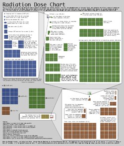
 There is a lot of discussion these days about radiation links from the damaged nuclear reactors in Japan. Unfortunately, there is little mention of the amount of radiation and it’s danger. This infographic was shared by Randall Monroe through his XKCD blog.
From the Source:
Ellen, a friend of mine who’s a student at Reed and Senior Reactor Operator at the Reed Research Reactor, has been spending the last few days answering questions about radiation dosage virtually nonstop (I’ve actually seen her interrupt them with “brb, reactor”). She suggested a chart might help put different amounts of radiation into perspective, and so with her help, I put one together. She also made one of her own; it has fewer colors, but contains more information about what radiation exposure consists of and how it affects the body.
Note that there are different types of ionizing radiation; the “sievert” unit quantifies the degree to which each type (gamma rays, alpha particles, etc) affects the body. You can learn more from my sources list. If you’re looking for expert updates on the nuclear situation, try the MIT NSE Hub. Ellen’s page on radiation is here.
Instructional Suggestions:
This infographic will certainly provoke conversations about radiation, various radiation related health diagnoses and treatment. There are also opportunities to integrate mathematics, asking learners to compute proportions.
Data Source(s):