 This is a cool interactive visualization that enables the user to compare the states with other states and with the national average. Again, lots of opportunities to ask questions that start with “Why?”
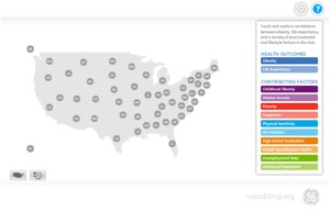
The visualization above, created as part of GE’s sponsorship of TEDMED, allows you to take an in depth look at the relationship between risk factors and common conditions by state. You might be surprised by what you discover. Please take a look and share your insights.
The product can be used online or downloaded as an application.
Blog Post: http://visualization.geblogs.com/visualization/tedmed/
Download Application: LInk