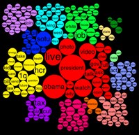
Graphic of "Whitehouse" tweets
From the Cool Infographic blog entry I learned about this from..
Similar to a word cloud, the area of the circles is sized based on the frequency of that word in the Twitter stream. Words are clustered together and color-coded if they are often found together in the same Tweets. The actual text of the Tweets is displayed next to the visual, so you can click on any word and it’s highlighted in the text as well. Clicking on any Twitter names in the text will generate a new visualization for that Twitter user.
I think it would be interesting to plot and talk about the most tweeted terms of various politicians. Here is a list of politicians who Twitter, headed by the President with over seven-million followers.
Original Blog Entry: http://goo.gl/ageVi
Infographic: http://goo.gl/YcSf8
(Sent from Flipboard)
… Sent from my iPad …